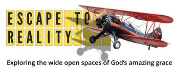
Two Buttons
Before you are done reading this post, I hope you will press one button and possibly two. So get your button-pressing finger ready, because here comes the first button.
The first button
We’re test-driving some concept art for the cover of the new AD70 book. This is exciting stuff, at least for me. But I need your input.
Which of the books below would you be most likely to pick up in a store?
“Paul, how can I pick a cover if I don’t know what the book is about?”
This book is partly about the events of AD70, but it’s mostly about Christ’s parables and prophecies of judgment. In fact, the subtitle of the book is Finding Good News in Christ’s Parables and Prophecies of Judgment. Here’s the blurb for the book:
Is the world going to hell in a handbasket? Is ours the generation that will be left behind? Are global events harbingers of the great tribulation? Such questions promote a fear and anxiety that is contrary to the hope-filled gospel of Jesus Christ.
In AD70 and the End of the World, Paul Ellis offers an alternative, gospel-based perspective of the last days. Based on an in-depth study of scripture and the forgotten lessons of history, he reveals the astonishing good news hidden within Christ’s parables and prophecies of judgment.
This book is the antidote to pessimistic prophecy. It answers questions about Judgment Day, the rapture, and the end of the age. It reinterprets dark tales of vengeance and wrath through the bright light of grace.
If you are weary of gloomy forecasts or are anxious about the apocalypse, AD70 and the End of the World will give you a confident and joyful expectation of a bright tomorrow.
Which cover do you feel best represents that blurb AND looks good enough to read? (Click on the image for a better view.)

Having trouble deciding? You can choose up to 3 covers in this poll:
I need your vote by Thursday 23 Feb 2017 at the latest. Thanks in advance. If you have any comments about these covers, feel free to let me know below.
The second button
I want to thank everyone who signed up as E2R patrons last month. As you know, your names are going in the ebook version of Stuff Jesus Never Said.
I did say that book would not come out for a couple of months, but things have been moving faster than expected. In fact, the ebook comes out today!
That’s right, Stuff Jesus Never Said is available right now on Kindle and PDF:
 |
 |
Personally, I still think the hardback version of this book is the way to go, but I appreciate it’s a little pricey and expensive to ship if you live outside of the US of A.
So if you have been waiting to read this gold-medal winning book (cough), your wait is over.
Just press the button.


Hey, bro! Did you see my Facebook text re the book cover ? Patreon was down at the time , so I sent it via text : ) Wow–things really ARE moving along briskly 👍👍 can’t thank you enough for the grace message that God had entrusted to you. It IS spreading. More and more musical artists are understanding grace. I do think we’re living in exciting times 🤠
Yes, thanks Don.
I’m giving away the hard copy version of this book today, but can’t afford to do that very often and I still think a hard copy is the best route. Have you thought about a cheap paper copy, something in the 2.50 range?
Kurt
We thought about doing a paperback version with a black and white interior (full-colour printing is expensive), but figured the images would lose a lot of their impact. These books are printed in China, which is the cheapest place in the world to print, but that means we have to hire freight forwarders and shippers just to get them to Long Beach where we pay for warehousing and packing. It all adds up when you’re dealing with real books. Did you know you can gift Kindle copies to friends?
C, because it looks like what actually happened in AD70. The others imply a futurist eschatology.
Honest first impressions:
City – looks like something Hollywood is marketing
Fire – looks like a boring history book
Sun – looks like Australia or Africa – not pulled to this picture at all
Cloud – just looks like a picture from an airplane window
Leaf – Looks like there is meaning hear. I’m pulled in to ponder what it is representing. I want to read the title of the book to see if it explains the cover art. I want to open it and read a little.
Indeed, the Leaf cover stands out from the rest.
I think the leaf is the most attractive, visually. I just don’t appreciate the flames around it. If this book is about hope, then a green leaf truly represents that; but a burning leaf does not. Just my two cents!
Have you noticed the leaf is not consumed by the fire? Does that remind you of anything?
Yes Paul! I noticed the leaf wasn’t consumed, after I had voted for the sun but also wondered if it was obvious enough to understand the significance of that fact to all who would glance at the book and wanted to read another book on end times.
I gave up reading end times books Well over a year ago, I won’t even read the reviews now, so many conflicting issues among them that destroy ones peace of mind and leave one frustrated for the facts.
In saying that I am very keen to read your book, only because I know you and trust your work, I have been an ETR consumer for a good couple of years maybe even more than that,
I enjoy all your posts, never miss one! Yourself and Andrew Farley, Truly! Are His Kingdom Shepherds.
PS I will vote again for the leaf, because I really did love that cover. ✔️
Thanks, Anne. Interestingly, in an earlier version of the blurb I had “this is a book for people who are tired of hearing about the end times.”
I did not notice that at first! I think the realist in me just saw a leaf on fire. But now that you mention it, yeah, it is symbolic that it isn’t being consumed by the flame. I still voted for this cover because of its visual impact, and that would definitely intrigue me to pick it up in a book store. I agree with others here about the sun reminding us of Africa, and the city does speak of 9/11 destruction. The clouds picture does not look professional, sorry, it does look like an amateur shot by a person in an airplane. And I would definitely not pick up a book that had fire on the cover, because I would assume it was about “hellfire and brimstone” type stuff. I think for people in our culture, fire is going to represent destruction. In ancient times, it was life-giving. It just doesn’t mean the same thing to today’s people (unless you love camping and s’mores!).
CR , I liked your last sentence : ) we all need a little humor lol I do agree with you about the other choices.
Hi, Paul,
My comment is not towards the cover art, I think all five convey a different aspect of the blurb, and all of them look really good (my personal choice was the leaf or the fire ones). But, there’s something in the blurb that I would change. Instead of “It reinterprets dark tales of vengeance and wrath through the bright light of grace”, I think saying “It refocuses dark tales of vengeance and wrath through the clear lenses of grace” does more justice to your teachings and the work you do regarding the Bible and the Gospel (I’m not sure if it’s correctly written, english is not my first language, hope you get the idea).
I wish you the best of luck with the book, and may it reach a wide public.
God bless you,
Maurício
Thanks, Mauricio.
The 2 cps of stuff Jesus never said I bought from you is very enlightening to me and my wife. I sent the other copy to my sister in the Philippines with the hope that they will also be enlightened on the Grace of our loving Father.
Thanks paul! H’ve realized the sunny hardcover goes hand to hand with the grandiose goodnews to the expression of the brightest covenant of grace.
A: city
Much love, Matt Turner
Around here that cover is known as the Michael Bay movie poster.
Hi Paul,
70 AD was bad for the Jews but 135 AD (the “end of the Roman Wars”) was even worse because the Romans banned the Jews from returning to the city, (apparently over the issue of circumcision) and changed the name of Jerusalem to Aelia Capitolina and built Roman temples in the “colony”. Who knew?
Obviously, this brought an end to the Jewish bishops in the Jerusalem church and Gentile bishops (who did not do circumcision, thankfully) took over. This might somehow be relevant to your book if you were not aware.
Lenny
Thanks, Leonard. I do mention the AD135 destruction of Jerusalem in the book.
Has to be C bro a burning temple that is what happen in AD70
HI Paul This is my honest first impressions about the book covers and my thoughts. IMHO if you are going to pick up a book to read the blurb, you will need to be captured by the cover..
a) City It was dark and for some reason 9/11 stood out to me. The darkness just seemed uninspiring and fear inducing. (Maybe 9/11 was what you are going for..).
b) Leaf. I voted for the leaf. I really liked it. Its simple and uncluttered and eye catching.
c) Fire. It reminded me of old boring school books. It wasn’t inspiring at all. If I saw it in a Christian bookshop, I most likely wouldn’t even bother picking it up.
d) Sun. Looked like it was about Africa and possibly a novel.
e) Cloud. I also voted for this book cover To me it was intriguing and most likely make me pick up the book to read the blurb.
Thanks for sharing your thoughts, Bev.
My personal preference – it was a difficult choice between the ‘cloud’ and the ‘leaf’ – would be the ‘cloud’. I love the leaf because to me it speaks of greenery and life, but seeing the leaf burn made me uneasy. In my ‘pre-grace-revelation’ days, I would have gone for the fire cover, because it would have satisfied the “I TOLD you so!” in me.
People I know who are atheists would probably go for the ‘city’ because there is no mention of God on the cover and because it’s reminiscent of a good scary movie. The ‘sun’ option just reminds me of Africa – if there was no mention of Christian things on the cover it would make make a lovely travel book cover.
You’d be a fool to not go with the fig leaf. 15 years of graphic design says so.
Wait, it’s not a fig leaf? It should be.
The artist came up with this independently. I said, “It looks good, but can we swap it for a fig leaf.” She did, but it didn’t look so good, so we went reverted to the original. I have no idea what sort of leaf it is.
Hey, Anne. I’m like you. Paul and Andrew Farley are the ones I trust the most. If I lived in Lubbock, Tx, I would definitely go to his church. I do listen to his services on Facebook and podcasts of his Sunday radio program.
I only voted for one choice (the leaf), but the cloud is a good second option.
I might be in the minority but I chose the fire in the temple. First I was going to go with the leaf, because it is positive and life. I did not want to go with city ….reminds me of the “Late Great Planet Earth. Nor the Sun …I see no connection. Nor the Cloud..I don’t see the connection. But let me say I chose the Temple burning not because I am looking for the revenge on the Jewihs religion. The judged themselves. But because I really think 80% of Christians do not even know the history of 70AD and then should know it was about the temple.
I was thinking the same about the city cover -” The Late Great Planet Earth” lol I think that dates us , TruthProspector : )
I love the Sun because the promises and prophesies of Jesus are hopeful for all who believe, not terrible!
I vote for “Fire”. It’s more in keeping with the actual event.
City and cloud are most appropriate
Thanks for voting and providing feedback everyone. I really appreciate you taking the time. My final choice will be revealed at Easter, when the book comes out.